Here are three more pieces that come from the exhibition of art relating to St Francis of Assisi (following on from my post a couple of weeks ago of work by Matthew Paris at the same show.
First an excellent example of Spanish Baroque naturalism, by Murillo.
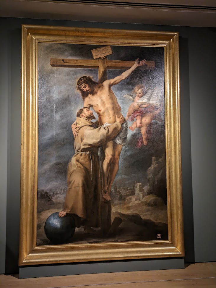
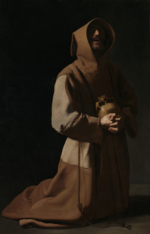
It is, at a guess 10ft long. Baroque artists painted so that the pictures pops into focus when viewed from the distance of approximately 3 times the distance of the widest dimension. So this one is meant to be viewed from approximately 30 feet away. At this distance the viewer can see the whole painting without having to scan the eyes over different parts of the painting because the angle of vision is approximately 15 degrees (15 degrees is the arc of the central vision in the eye that is in focus). If the viewer moves any closer he has to move is eyes or his head to different part of the painting to take in every detail. Given this, we can assume that it was meant to be viewed from within the congregation of a large church.
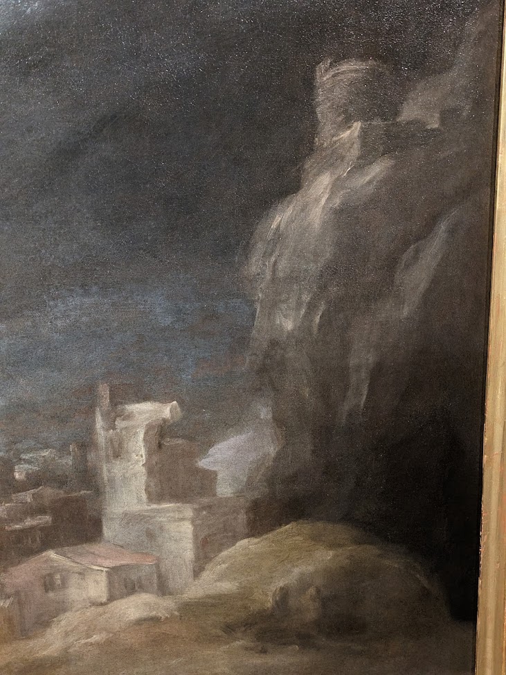
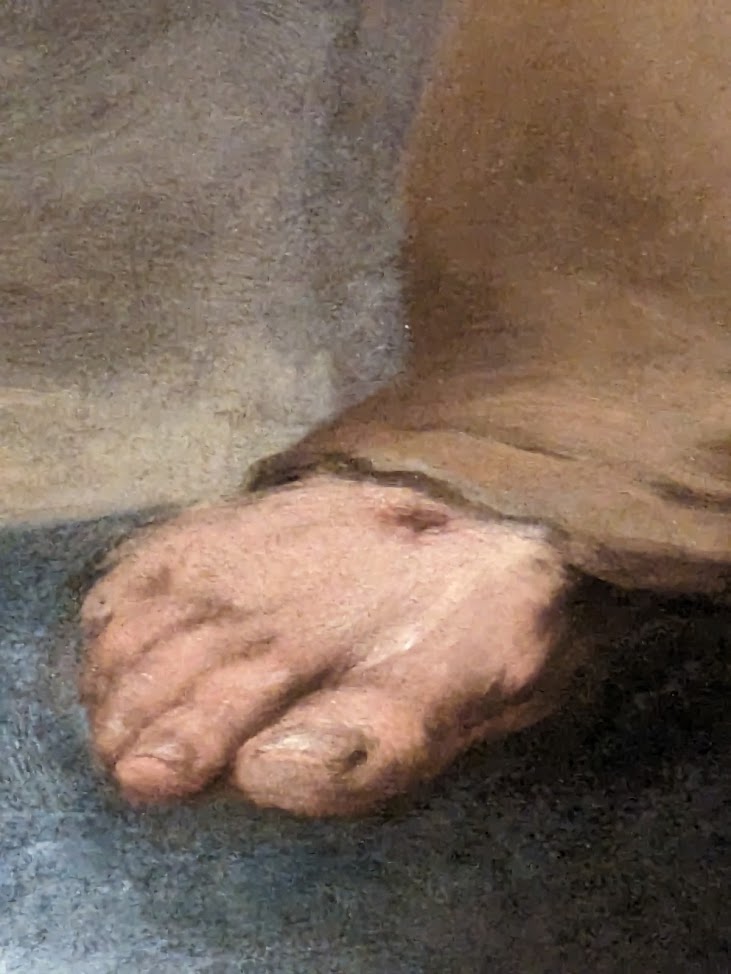
When viewed from this distance edges of shapes in the composition which are blurred in the actual painting itself appear sharper. This is why when you approach the painting it surprises you by how loosely and out of focus so much of the composition is, as these details reveal.
The areas that are intended to be the main focus of interest and which communicate the interaction between St Francis and Our Lord, will always be made slightly sharper so that from a distance it is very sharp and clear. So the loving interraction is communicated primarily through the gesture of each figure.
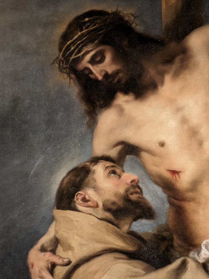
Notice also how muted the color palette is. Again this is typical of baroque art which emphasizes tonal, rather than color variation in order to show a high contrast of light and dark. Through this high tonal contrast the artists, by another visual means, draws our attention the primary focus in the composition – the eye is always naturally drawn to those part in which the contrast between light and dark is greatest. This has the effect of rendering the lights brighter. The contrast of light and dark tone is meant to symbolize the Light of the World that overcomes the darkness of evil, suffering and sin.
The second painting, is also Spanish Baroque, and is a famous image of St Francis by Zurburan. This has the same visual vocabulary as described in the Murillo above – the use of light and dark, muted color and a controlled variation in focus. Again, to great effect.
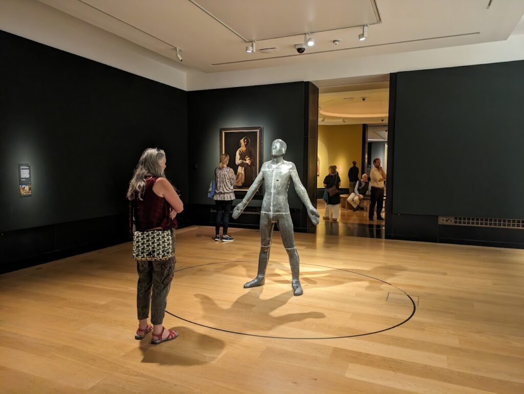
Contrast these two with a 20th century sculpture by the British artist Anthony Gormley. This is typical of the modern approach in which artists imbue the figure with their own interpretation in such a way that if were not told what it was, or what the symbolism was, we would not be able to discern it.
This piece is actually a cast of the artist himself, adopting a posture of a famous painting of St Francis by Bellini, which also shown at the exhibition. So while there is, admittedly, some connection to a traditional portrayal of St Francis (see below), nothing else that I see speaks of the historical figure, of his sanctity or his spirituality. In fact the androgenous nature of the figure which is unclad, seems instead to dehumanise him and desanctify him. I would argue that rather than inspiring people to emulate the sanctity of St Francis, it actually mitigates against anyone recognizing St Francis in this figure. By forcing the association through the naming of the piece, it serves to undermine our grasp of the greatness of the saint. In this sense it is anti-sacred. It conveys to me no sense of virtue, no life details, or anything else that inspires me to emulate his life. I am happy to believe that it may well be there for the artist, but this is such a highly personal approach that it is more likely to distract those who see it from knowing who he was and what he was like. I cannot speak for the artist in this particular case, but this drive to undermine the Faith, is consistent with the goals of contemporary art.
In criticising the art, I would add that I am nevertheless in favour of such pieces appearing in the exhibition. The National Gallery is not a church. Provided that the Christian art is properly represented, which it most certainly is in this wonderful exhibition. I feel that these modern, anti-traditional works of art, help us to focus on what a Christian ought to do and appreciate tradition even more.
From the Anthony Gormley | David Clayton | Matthew Paris | Murrillo | Sacred Art | Spanish Baroque | Zurburan series
View more Posts